Most web designers say that it is not so much of the visual design that counts when it comes to successfully designing or developing a design for a website. More importance is given to functionality and good user experience as websites are intended for online visitors or users who are looking for something that are contained in the website. A user-centered design has become a standard way of approaching a design task for any website, following the principle that satisfied users will undoubtedly return to the website which in turn could translate to commercial success.
An effective website design therefore requires combined elements of usability, functionality and quality content, that is, relevant information which the users or internet searchers are apparently looking from your website. Web designers also keep in mind that users do not read – they scan. Instead of reading every textual line, users search for some fixed points or anchors, which would guide them through the content of the page. As such, designers are guided by the following design principles:
- Don’t make me think.. Web designers are tasked with creating a simple and understandable visual flow for the users. This means that the web page should be obvious and self-explanatory. Users should no longer be forced to think of what the website is all about or what the page contains. In order to accomplish this, web designers should be able to create a web page that is easy to navigate and where buttons or menus will lead exactly to the intended content. A web page should have moderate visual clues and a clear and systematic structure which will enable users to find their path to their browsing goals.
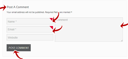
- Keep user requirements minimal. For first time visitors, it might be acceptable for them to fill out short forms and share some information like email address and other personal information. But it won’t be advisable for designers to bombard the users with a lot of requirements to comply with just to be able to test a feature on the web page. Users are not likely to return to the site that has more than the essential user requirements.
- Create specific points for users to focus their attention. Websites do have static and dynamic content, and some aspects of both can get the attention of the user. For example, an eye-catching image can easily divert the attention of a user from reading a textual content. In the same manner, text contents which are highlighted or marked bold or in different font type may also turn the user away from the image to check out what the content is all about. A web design should be able to mark both static and dynamic contents with some elements that will get the attention of the users.
- Keep the site features obvious. By presenting clearly what the site or page wants the users to do, web designers should infuse visually appealing guide or 1-2-3-done-steps that will lead the visitors and users through the site content in a less-complicated and more user-friendly way.

- Adjust the writing style. In most cases, promotional write-ups may not win the attention of the users or visitors. There’s no room for long text blocks without photos. Readers prefer short but concise sentences which drive the point home. Web designers should avoid marketing-associated words or phrases, clever names and unfamiliar technical terms. By being precise with the wordings, users are able to appreciate the content more.
- Keep it simple and easy to understand. This should be the working guideline and principle of any website design. Most users visit a site, not to enjoy the design but to look for the information they need regardless of how the site looks like. Web designers should strive for utmost simplicity but without missing visual satisfaction.
- Make use of spacing – line, padding and white space. Spacing makes things clearer. While others may think that empty spaces are wasteful, the opposite is true. White or empty space provides balance, contrast and proportion to a web page.
- Font Types. Text is an essential element on a website design and web designers should consider the font type, size, spacing, line length and color.
Keeping the essential design principles in mind while the website is in the completion process, the end result will not only leave the website owners satisfied; it will also leave the users contented with the design, content and functionality. Coming up with great web design and developing a well-organized website requires people who has the eye for design and skills in creating efficient website.


